The Importance of Responsive Web Design in 2024: A Guide to User-Friendly and SEO-Friendly Websites
UI/UX
web design
Posted by admin on 2024-05-04 14:07:00 |
Share: Facebook |
Twitter |
Whatsapp |
Linkedin Visits: 2592
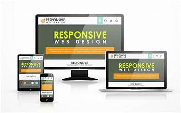
In today's digital age, users seamlessly switch between desktops, tablets, and smartphones to access the internet. This ever-evolving landscape demands websites that adapt to their screen size and deliver a flawless experience. This is where responsive web design (RWD) comes to the forefront.
This comprehensive guide dives deep into the importance of responsive web design in 2024. We'll explore its impact on user experience (UX) and search engine optimization (SEO). We'll equip you with best practices and tips for implementing RWD, along with inspiring case studies of successful responsive websites that showcase its power.
Understanding Responsive Web Design: A Chameleon-like Approach
Responsive web design is a web development approach that ensures your website looks and functions flawlessly across all devices, from wide desktop monitors to tiny smartphone screens. It utilizes flexible layouts, fluid images, and media queries to automatically adjust content based on screen size.
Think of it like a chameleon – your website adapts its appearance to perfectly blend with its environment, in this case, the user's device. This ensures a consistent and comfortable browsing experience, regardless of the device used.
Why Responsive Web Design Matters More Than Ever in 2024
Here's a breakdown of the key benefits that solidify the importance of responsive web design in 2024:
- Enhanced User Experience (UX): Imagine a user trying to navigate a website with tiny fonts and buttons on their phone. Frustration sets in quickly. Responsive design eliminates this problem by offering a smooth, user-friendly experience across all devices. Users can easily navigate menus, read content, and complete desired actions without zooming or scrolling excessively. This translates to increased user engagement, longer dwell time on your website, and ultimately, a higher chance of conversion.
- SEO Advantages: Search engines, especially Google, prioritize mobile-friendly websites in their search rankings. A responsive website ensures a consistent user experience across devices and simplifies website crawling for search engines. This can lead to improved SEO performance and higher organic traffic.
- Cost-Effectiveness: Maintaining separate mobile and desktop websites can be expensive, requiring double the development and maintenance efforts. Responsive design eliminates this need by creating a single website that adapts to all devices. This saves you time, money, and resources in the long run.
- Future-Proofing Your Website: The world of technology is constantly evolving, with new devices and screen sizes emerging. A responsive website adapts to these changes, ensuring your online presence remains relevant and accessible for years to come. Responsive design ensures your website is ready for whatever the future holds.
The User-Experience and SEO Powerhouse: How RWD Delivers
Now that we understand the significance of RWD, let's delve deeper into how it impacts UX and SEO:
- User Experience (UX): Responsive design translates to a frustration-free browsing experience for users on any device. They can easily navigate menus, read content, and complete desired actions without zooming or scrolling excessively. This fosters user satisfaction, builds trust, and encourages them to return to your website. Responsive design caters to the modern user who expects a seamless browsing experience, regardless of their device.
- Search Engine Optimization (SEO): Google's mobile-first indexing prioritizes websites that deliver a seamless mobile experience. Responsive design ensures your website meets this criteria, improving your chances of ranking higher in search results. Additionally, responsive websites typically have faster loading times due to optimized images and code, another ranking factor favored by search engines. Responsive design indirectly boosts your SEO efforts by creating a website that search engines and users love.
Mastering Responsive Design: Best Practices and Tips for Implementation
Implementing responsive design might seem daunting, but fret not! Here are some key best practices and tips to get you started:
- Mobile-First Approach: Design your website with mobile devices in mind first. Prioritize essential content and functionalities for smaller screens and then expand for larger devices. This ensures a smooth user experience on the most commonly used devices.
- Fluid Grid System: Utilize a fluid grid system that allows website elements like text boxes, images, and menus to resize and rearrange based on screen size. This ensures optimal layout for all devices, from desktops to tablets and smartphones.
- Flexible Images and Media: Images and videos should adapt to different screen sizes without losing quality. Utilize responsive image formats (like JPEG 2000 or WebP) and CSS media queries to achieve this. Media queries are coding statements that allow you to define specific styles for different screen sizes, ensuring your website adjusts its image formatting based on the device being used.